Everyone has at least one friend in the printing business, even if it's just yours truly. Why do people keep secrets from their friends? Don't they watch TV? Don't they know it always ends badly?
Apparently, there are three things print buyers are ashamed to share, and they are as follows: How many are needed? What needs to happen for proof approval? Where do they go when the job is finished? These questions have been touched on in previous posts, but their recurring omission indicates they deserve special attention.
"I need to get started right away, I'll tell you the quantity later" is self-contradictory. If you REALLY need to get started right away, include the quantity when the order is placed. It allows paper to be purchased, has an impact on how the job will be run, and, most importantly, precludes the chance for an error to be made if the quantity is plugged in later. Please note that the quantity is the grand total of your mailing list plus extras for the mail processor, plus however many you want leftover.
"If you can get us the proof in the morning, the committee will look at it immediately" is also bad tidings. The more people who need to approve the printers proof the greater the chance that it will not survive intact. This is fine if you're not on deadline and don't care about the cost of changes. (If you meet someone like that send them my way, because, as of yet, we are unacquainted.) In order to schedule a job accurately it's important to be honest about what needs to happen for approval so that time can be blocked out for careful review. If you don't at least have a discussion with the print vendor, that's not possible.
"I'm not sure where they go, can we decide that later"? The answer, of course, is yes...but that doesn't make it OK. First, the nature of the destination may have a bearing on packaging and delivery details such as; in boxes or on pallets, loading dock or inside delivery, etc. Second, if the destination is out of town the delivery date may need to be a day (or three) earlier to allow for travel. Last, someone like me doesn't need an extra opportunity for screw-ups with information is coming in as the job is trying to go out.
Sometimes, like a marquee quarterback, the printing team needs to assess the situation and "call an audible" as the job is in progress. It's actually exciting, and when a plan flows, and adjustments are made, and the project succeeds it's a great feeling. I'm not kidding...it's exhilarating! Any good vendor should be able to stick with you through this kind of situation, but just because you CAN doesn't mean you SHOULD.
More often than not "Boring is best". Place the order with complete information, narrow your approval group to the minimum number possible, and think through in advance where all this stuff (which may be several hundred pounds) needs to go. That way you can depend on other facets of your life for the adrenaline rush...like bungee jumping...or parenthood.
With best wishes for the Holiday Season,
Hugh Butler
Your friend in the printing business
Friday, December 19, 2008
Friday, December 5, 2008
"It's my budget, Doc"...Letters collide with numbers
What good outcomes can result from the collision between creative professionals and budget professionals in today's economic climate? None, you say? Read on...
.I can think of two and will discuss them presently. This post will the first of several occasional topics for saving your budget, without losing your sanity, under the heading "It's my budget, Doc".
.
First, this is the ideal time to insist that your final in-house proof be checked and approved seriously by anyone who will later be tempted to tear the printer's proof to pieces. Your boss shouldn't be able to simultaneously cut your creative budget, and cost you extra money by forcing rework and new proofs once the job is at the printer. This may be the ideal time to get their attention by speaking loudly in a language they understand...MONEY!
.Second, invest in typographic skills. I have always thought that an informative exam question for a student designer would be a one-color business card. If your layout makes an immediate, coherent impression, and the information on the card is instantly navigable, you have really achieved something special. Much of the success will depend your use of type.
.... 
Effective use of type is not only economic, needing neither graphics nor color, it adds a unique depth to your page layouts. In the graphic-intensive environment we all inhabit, color, motion, and sound come at us all the time. The printed page, however, needs to do more than just convey a mood because it may contain a considerable amount of information. To convey that information effectively the page must not only get your reader's attention, but hold it long enough for the page to be read.
.
Readers tire easily, and you can take advantage of three thousand years of human effort by continuing your study of the noble art of letter forms, and their relationships one to another.
.
So here is your plan for the next few days. On Sunday afternoon, go to your local bookstore and peruse the volumes on hand relating to typography. Perhaps you might enjoy a cappuccino while you read, and feel the warmth of being surrounded by the printed word. Maybe you will even purchase the book you find the most valuable.
.
On Monday, you will return to work relaxed and refreshed. When you show your boss the final proof of your next project, and they glance at it saying "I'm sure it's OK", roll the proof up tightly and swat them across the face. As they recover, and you have their full attention, say to them "I need you to check this carefully, if we have to rework and reproof that will cost money, and, in case you hadn't noticed, that stuff doesn't grow on trees".
.
What a great way to start the week...call or email me to let me know how it goes. Until then, see you online!
.
Hugh Butler
Your friend in the printing business
.
Artwork reproduced with permission from The James Madison InstituteWednesday, November 26, 2008
Happy Thanksgiving
 "Home to Thanksgiving" Engraving by Currier and Ives
 Best Thanksgiving Wishes
from Hugh Butler
Your friend in the printing Business
November, 2008
Friday, November 21, 2008
Lost in translation
Karla (her real name) visits a foreign country occaisionally and notices that people's faces are red and the sky is purple. What gives?
The foreign country is CMYK, which are the reflective ink colors used to print her publications, and her home state is RGB which are the colors beamed at her by her monitor. The unexpected shifts in color which trouble her are "lost in translation" between the two. They are like words in Italian which have to English counterpart. It can be embarrassing...and expensive if you have to rework and reproof.
There are two problems: First, CMYK is a terrible pallette...how can you paint a picture using only three colors plus black? It's a miracle it works at all. Second, no matter what filters are applied, your monitor always shows you RGB. It tries to emulate CMYK but can't achieve 100%. What to do?
A poll of the Your friend in the printing business knowledge base last week yielded these suggestions: (Thanks to Rich Emond, Stewart Nelson, and Michael Calienes for feedback).
HARDWARE ISSUES
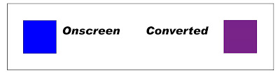 This nice RGB blue on the left converts to CMYK as 88,77,0,0. A color with 77% magenta is going to print purple; think about the numbers...how can it not? (The swatch on the right is an approximation of that mix as it appears in printed ink.) This is one of the major translation issues...this blue is the one you will get if you choose "blue" from color pickers in Word, for instance, and it's the default blue for hyperlinks. It's also a typical blue from a sunny sky. Beware.
1) Check to see if your monitor is actually defective by taking your file as a PDF to another machine with the proof or printed copy for comparison.
2) Calibrate your monitor; on the MAC side I understand this can be done through the system folder and on the PC you go to display>settings>advanced>color management>add profile. Try adding the adobeRGB1998 profile as a default and see if things improve. If not, try another one.
3) Find access to a CMYK printer which yields results similar to the printers proof. These prints can range from free to about $1.00 per sheet and give you a cue to potential problems. This might be your own personal printer, a machine at your print vendor, or even FedEx Kinko's. Some of our customers will ask for a high resolution printers proof of a batch of photos they plan to use by creating a 12 x 18 file and placing 6 or 8 photos on it and proofing that one page. The important thing is that it is a CMYK print.
COLOR CORRECTION BY THE NUMBERS Assuming nothing above helps, here's the final frontier. It's based on the fact that your monitor may lie like a rug, but the CMYK values you can read from the image in PhotoShop (with the eyedropper tool) do not.
Hints: Run the eyedropper tool around and look at the numbers, think about the numbers and what they are trying to tell you; do feedback loops to see which colors print properly; be suspicious of colors with more than 40% black; de-saturate reds in snapshots; and whenever possible CHOOSE YOUR COLORS FROM A PRINTED PANTONE REFERENCE!
Here is information about skin tones from Apogee Photo Magazine
For "white" skin in CMYK, cyan levels should be 1/3 - 1/5 those of magenta and yellow. The magenta and yellow should be about equal, perhaps the magenta just a bit stronger than the yellow. For darker/lighter skin tones, or those with a different colorcast, CURVES may be used as before to introduce the necessary changes. African and Asian skin will have less magenta than cyan or yellow (CYMK).
The complete article is at http://www.apogeephoto.com/june2000/color_correction2.shtml
Here are some related resources I came across while researching this topic:
http://movielibrary.lynda.com/html/modPage.asp?ID=419&cid=419 free and paid tutorials at Lynda.com
http://www.mosaicdesignservices.com/webgraphics/tutorials/pe/ColorCorrectionPE30.pdf Color correction by the numbers in some detail from Mosaic Design Services...it's old but still useful...how to get rid of a color cast in an image'
The grand-daddy of correction by the numbers:
Professional Photoshop: The Classic Guide to Color Correction
By Dan Margulis
Published by Peachpit Press, 2006
ISBN 032144017X, 9780321440174
By Dan Margulis
Published by Peachpit Press, 2006
ISBN 032144017X, 9780321440174
The key is to understand the limitations of your monitor, where your problems typically come from, and to learn ways to predict and prevent them. Or get used to people with red faces living under a purple sky!
Your friend in the printing business is currently read by about 100 people each week, and is a lot of fun for me personally. I hope you find the information useful. It's time to formally thank Dave Fiore, whose blog Small business unplugged gave me the idea in the first place. Dave is a long time customer, a great guy, and a superb writer and editor. Thanks, Dave!
To place yourself in contention for next weeks drawing of the Atlanta Bread Company goodies please suggest a topic or question for a future post. We want ideas or tips for success as well as things to avoid at all costs! What's on your mind? As always, your feedback is welcome either online, by email, or in person if you have a project to discuss. Until then,
See you online!
Hugh Butler
Your friend in the printing business
Friday, November 14, 2008
I think I want, you know, like, the shiny paper?
The question from last week refers to the term "matte" in the printing trade and Shelley Call, although she didn't win the muffins, (Keith Cassebonne's name was chosen from the 12 responses) provided the exact answer I was looking for..she wrote:
To my understanding "matte" is usually used to describe paper with a dull finish. It is often confused with uncoated paper, but you can actually have a "matte" coating that is still dull in appearance. She then goes for the extra credit points by discussing matte finishes which can be applied after the regular inks go down, but we're limiting our discussion to the paper itself.
The key distinction when describing paper is whether it's coated or uncoated. It's at this point that the term "matte" often jumps in and, as Shelley points out, what people may mean is uncoated as opposed to a coated stock with a matte finish. If you don't know whether the paper you have in mind is coated or uncoated you stand almost no chance of communicating effectively what you are looking for. This is something you REALLY need to know. Here are the details which, for once, are relevant:
The ingredient in the mix which provides the coated aspect is clay (in addition to the routine pulp which all paper contains) providing a much harder, more reflective surface as the mix is rolled out in the paper mill. The coating (or absence of coating) changes radically the amount of light the sheet reflects. Printing inks are transparent...light passes through them and bounces off the paper, and the more light that bounces back the more light energy strikes your eyeball. The more your eyeballs are stimulated by this light the brighter your colors appear. The same ink film printed on coated and uncoated stock will appear as two completely different colors. Beware.
This is relevant in two ways; first because you want to predict what your colors will look like and second because you want to be sure you can describe the paper to be quoted.
Your colors should be previewed by checking them against a Pantone (or similar) printed reference book. (The Pantone.com link is on my main page for reference.) All of these terrific guides come in a coated and uncoated version...if you buy printing regularly, and you don't have them you are an accident waiting for a place to happen. But what if you need a preview of an image where there is no single color applied such as a color photograph or full color graphic?
In such a case, hopefully, your print vendor will supply your color contract proof on an uncoated material; if not you will need some considerable guidance from them about what shifts will transpire when the image is printed. In my experience, printing full color (CMYK) on an uncoated stock will often lead to colors which disappoint the customer, unless a muted effect is desired. It doesn't mean that the paper has to be glossy, but most often a coated stock seems preferable.
Here are your choices, (and we're finally going to get to the "matte" term in it's correct context).
COATED STOCKS: In descending order of "shininess".
Cast Coated text and cover, high mirror gloss, expensive, specialized, easy to confuse with regular gloss which has an extra top coating of gloss laminate, varnish, or UV applied by the printer (not native to the paper itself).
Gloss coated text and cover, nice and shiny, clean color, fast drying, little show through.
Dull coated text and cover, same as above but less shiny, easier to read, non glare surface, can be written on, sometimes needs an extra day dry time.
Matte coated text and cover, least shiny, most texture, quality varies A LOT, drying of ink often unpredictable. We're not crazy about it.
UNCOATED STOCKS
Book paper; Offset and opaque offset, similar to varying grades of paper for your copier or laser printer, inexpensive, low weight (for mailing).
Textured and Textured Cover; Available in a wide range of colors, textures and weights, great tactile properties, sometimes availability problems.
Writing papers; 25% cotton usually with a watermark for use as letterhead, envelopes and matching cards for stationery packages. It isn't cheap but the high level of quality is usually worth it for personalized written communication.
Index, tag, bristol; specialized uses for cards, tags, el cheapo postcards.
So there you have almost the entire universe of printing papers if you can remember eight basic grades. You don't need to know the paper business inside out, but these terms are important. Swatch books are available for typical brands and your vendor can help with the (unbelievably arcane) system of weights which apply. It's much more impressive to say "I want it on gloss text" than to resort to "I think I want, you know, like, the shiny paper?"
I appreciate the responses to last weeks question so much I'm going to use the same approach to gather information for next week. A reader asked about preventing color shifts when going from RGB on her monitor to printed CMYK color. Particularly skin tones which come out looking like the subject has a high fever, and blues which pick up a lot of magenta and say "HELLO, I'M BARNEY THE DINOSAUR"! Any responses will be combined with my own meager knowledge for next weeks post, and one name will be drawn from those who reply for the Atlanta Bread Company goodies. Let's see how much expertise we have out there among you PhotoShop experts.
Until then , see you online!
Hugh Butler
Your friend in the printing business
Friday, November 7, 2008
Gone WRONG, part II
Last week, in honor of Halloween, we suffered through problems with print quality and issues surrounding the printer's proof. This week we continue our bad luck with shortages and delivery. Finally, we'll search for the redemption of understanding in how how to approach these pitfalls, and then be able to move on to more cheerful topics.
Shortage problems: By tradition in the printing business, a delivery of 10% over or under the requested quantity constitutes completion of the order with the invoice pro-rated to reflect the actual amount. (There are actually good reasons why this is so.) By this logic an order for 1000 newsletters is considered complete if the vendor delivers 901 and bills you for that many. For many customers this may be unacceptable, but in the absence of an agreement it's likely what your vendor is thinking. What if your mailing list has 950 names?
Solution: Like so many things we'll discuss, the difference between a deal and a dispute is what you agree to in advance. If the exact quantity is critical specify the order as "1,000 copies, no unders". You will pay slightly more; this is because the vendor will need to purchase some extra stock to guarantee the count even if a small problem is discovered after the presswork is complete. If, however, the count comes up short there will be no dispute about the vendors responsibility to put the job back on the press. The main point is to have a clear understanding with the printer BEFORE the issue comes up.
Hint: Shortage problems often come up when the job is being processed at a mailer. Several possibilities exist; the printer's count may be short, the mailer may have spoiled or misplaced part of the order, or your mailing list may have more names than you anticipated. My first post addressed this last issue (see This will be Win-Win) and if you're joining this blog recently you may want to go back and read it in the archive.
Delivery Problems: Here your job is delivered late, to the wrong destination, or in a manner unsuitable for the destination, (think tractor-trailer showing up at plush office with no loading dock).
Solutions: If any aspect of the delivery is critical that information must be part of the original job specs. If it is then missing from the printers proposal, that fact should be corrected before acceptance, and be stated clearly on any purchase order. It's vital that this kind of information be conveyed (or at least confirmed) in writing and as early as possible in the process.
Hint: There is a WORLD of difference between "I need it next Monday" and "I need it next Monday by 8:30 AM when my boss will present it at a meeting in Tampa". If a delay of one day renders the product unsatisfactory, you need to be clear in advance that's the case and have an agreement about possible contingencies. It is unreasonable to make a claim for delay if information has been withheld and the job is proceeding on a "normal" schedule. Likewise, the vendor must be honest about the progress of your job, and if a delay becomes apparent may need to consider what steps must be taken to avoid a breach of their responsibility.
OK, let's restart the clock and call the vendor to discuss what happened and how to proceed. If the situation is clear cut, hopefully the party involved will own up to their responsibility. If responsibility is not so clear, hopefully the two parties will remember the value of their continued relationship and work to resolve the issue in a way which is mutually satisfactory.
Effective communication before the fact will prevent many..Blah, Blah, Blah, Blah.
You knew I was going to say something like that, and it's true. Just as true, however, is that things go wrong in a fast paced environment like a printshop. Things will also go wrong as long as customers have ten zillion other things to concentrate on besides their printing. When things go wrong after ink is on paper the cost of remedies are substantial, which is why we stress our mutual efforts BEFORE that crucial step has occurred.
Your best idea is to try and understand what's going on in the other person's world, and be aware of how they look at your common goal. If, then, you're clear about YOUR role in the process you can concentrate on doing the best possible job of dotting the "i"s and crossing the "t"s. That way you can open up the box and say "There! Now THAT'S what I expected"!
Here's a question related to next weeks post for your consideration: What does the term "matte" refer to specifically in the printing trade? I'll draw one name at random from any correct (or even close to correct) responses to receive an order of muffin tops from the Atlanta Bread Company, delivered personally by yours truly.
Thanks for stopping by!
Hugh Butler
Your friend in the printing business
Friday, October 31, 2008
Something has gone WRONG!
Something has gone wrong. Your order is complete but unsatisfactory because something is not what you expected. Let's freeze frame right here. Let's travel back in time to see where things go wrong, and what to discuss with the vendor (hopefully not me) to resolve the problem.
Here’s the scoop. This week we’ll look averting quality and proof related problems. Next week we'll look at problems with shortages and delivery and try to get a perspective on the issue as a whole.
QUALITY:
Problem: You'll know 'em when you see 'em. Color variation or mis-registration, uneven or incorrect trimming and folding, etc. Pull a few samples from various points in the run and see if the problem is persistent. (Sometimes a few "makeready" or set-up sheets get mixed into the run, and maybe it's not time to push the panic button.)
Solution: Call the vendor and ask for them to come see the samples, and if necessary go through the entire job to sort it out. DO NOT devote your own staff time to this task. DO NOT just suffer the problems in silence. Remedies can range from a sincere apology (minor problem) to a price adjustment (up to about 10%) to an out and out re-run if the product is truly unsatisfactory.
Hint: It's important to be up front about your expectations, and to speak up if you don't like what you receive. Printers work with a wide variety of customers, and some care a lot more about quality than others. You want to be sure they are aware of where you fall within that spectrum, and you will find out rather quickly if that vendor is a good match for your work.
PROOF RELATED PROBLEMS:
The key to understanding proofs is knowing who is supposed to do what:
Vendors are responsible for clarifying the limitations of their proofing system (none are perfect) and explaining what it is the customer is looking at. For instance, if a job prints in spot colors and the proof renders the colors badly, the vendor may need to provide a Pantone ink matching book. Another example is a proof is on white proofing paper, and the customer is unfamiliar with the actual stock...the vendor may need to provide a swatch along with the proof.
Customers are responsible for checking the proof IN DETAIL to be sure nothing goes wrong when the file moves from their system to the vendor's computer. Here are some things to watch out for in particular:
PROBLEMS:
· I can't tell you the number of times people have said to me "you can take this proof back with you right now" after merely glancing through the pages...this is a very dangerous thing to do. Just because nothing has ever gone wrong before doesn't mean this won't be the first time. The consequences of missing something can be dire and your remedies are virtually nil. If you don't understand what you're looking at, don't sign it...it's a contract.
· Beware the option on the proof slip which says "OK with changes" and you decline to see another proof. If there is a subsequent error, even if it's the printer's fault, you have waived your chance to object and the error becomes your responsibility. (Our proof slip doesn't even contain this option because it's so often misunderstood.)
· What about when an error does not show at the proof stage but later shows up in the work? Sometimes a subtle technical graphics problem will arise, and in retrospect the proof has provided only a muted warning. This is a tough one...it's the price we all pay for the convenience and economy of digital proofs. There may be an incompatibility with the vendor's system, or someone may have just screwed up. You may be back to "apologies, price adjustments, re-runs". Its not what the customer or the vendor would like... if you have ANY suspicion that something is wrong make sure you indicate it on the proof and bring it to the vendor's attention.
SOLUTION: Remember the critical importance of proofing because the customer has the ultimate responsibility for this function. If they delegate that role to the vendor they do so at their own risk. Never assume that a problem you see is "just a proofing issue" without the vendor's commitment to verify that's true, and to indicate so on the slip you sign. This will keep you on solid footing if something should go wrong.
HINT: No one knows why an error seems invisible on the proof, but is the first thing you see when you receive the job. A major way to improve your workflow is to stress the importance of your final "in-house" proof among your staff...(maybe even tell them it's the printer's proof to get them to focus). The more correct your file is on the way in, the more you can concentrate on the technical aspects of the printer's proof and not get bogged down on further rounds of editing.
Have a question, comment, or suggestion? Did something happen with a job you don't understand? Amusing (or not so amusing) story to share? Please comment online (can be done anonymously). Almost 100 people read this blog each week so there's a lot of untapped wisdom out there! You can also email me direct, and, as always,
Thanks for stopping by. See you online!
Hugh Butler
Your friend in the printing business
Friday, October 17, 2008
The envelope, please...
Or, more to the point: Which comes first, the envelope or what goes in it?
Answer: The envelope, definitely.
This is true first because if you design the envelope right away you won't forget it. (You would be AMAZED at the number of holiday cards that show up at our shop with no artwork for the envelope.)
Second, envelopes are only available in certain sizes, and you need to know the size to lay out what's going in it. If you don't you might lay out a card which really has no comfortable fit with envelopes that actually exist. Don't laugh, it happens! If the fit is too tight it's difficult to get the contents in or out, and if the envelope is too big it looks silly.
Here's your link: http://www.belightsoft.com/products/companion/paper/envelopes.php (Thanks to the folks at BeLight Software who publish this wonderful page.) The rule of thumb is that the final size of the contents should be 1/4" smaller in each dimension. For example: An A-7 envelope is 5.25 X 7.25 inches. The folded size of it's card would be 5 X 7. The unfolded size of the card (assuming it's folded and not just a flat card) would be 10 X 7. That's the whole deal.
Third, not every paper in the world is converted into matching envelopes, and even fewer of them are converted and actually stocked by distributors. This means you may fall in love with a paper, and convince your client to love it, only to find either the envelope unavailable, or to be had only in full carton quantities from the mill (1,000 or more). A quick message to your printer can confirm availability before you go ahead.
Most questions arise on the subject of holiday or note cards, so take a look at the link for Announcement or Baronial sizes because these are most commonly used. (One has straight flaps and the other are pointed.) The most popular sizes are A-6, A-8, and A-10 or their baronial counterparts. Square envelopes are also available though not listed in the link...they come in about 1" increments, just remember you will pay extra postage. Again, you can always call or email your printer to check availability.
Advice from 2007: Don't put off layout for your holiday card 'til the third week of December! Be a printing superstar and turn it in about a month in advance... you will stun your colleagues and vendors with your amazing skills. (At our shop you will also get special pricing.)
Keep the size and style link handy, or at least remember it's here. It'll save you revision costs and frustration and, most important, make you look like a hot shot.
Thanks for stopping by!
Hugh
Your friend in the print business
Wednesday, October 8, 2008
How many do you need?
"How many do you need?"
If you need to get a project produced quickly, it's best to know exactly how many to order BEFORE you contact the printer. An order with an indefinite quantity begins life with a loose end, and an opportunity for things to go wrong down the line. Here's the equation:
(Quantity for your current mail list) + (However many over the mailing service will need for set-ups and screw-ups) + (How many copies you want delivered to your office) = GRAND TOTAL
One piece of advice from 2008 so far...DO NOT CUT YOUR QUANTITY TOO LOW. Several projects this year have gone back to press for additional copies when the original quantity was chosen too low, or demand exceeded the customers' bare-bones guess. When you arrive at the Grand Total, ask the printer about rounding up a little and find out if the price increase might be negligible. The price of re-plating the job and going back to press will be many, many times that of adding a comparable quantity to the original order.
The place to plug this step into your time line is when you start the last round of type revisions...that's when you want to get your current list count (which often takes a day or so) and check with the mailer. By the time the artwork is approved, you're ready to go for real!
The bottom line is that an order placed with complete information stands a better chance of proceeding without nasty surprises. It cuts down on the possibility of error, and allows your vendor to get all pertinent information on the work right from the start. They will appreciate it!
There...what do you think? Watch for emails when new posts are published, and if you like it here be sure to tell your friends!
Thanks for stopping by,
Hugh
Your friend in the printing business
Subscribe to:
Posts (Atom)
